|
|
Post by Breneir Itravilatx on Aug 6, 2009 21:39:33 GMT -6
Can we change the font? I am typeface nerd...can we use a more appealing font for such a public item as our currency. What about a font similar to the one used on the Brazilian Real?
|
|
EM Vürinalt
Citizen since 12-20-2007
Parletz, am?c, en entrez
Posts: 979
|
Post by EM Vürinalt on Aug 6, 2009 21:58:37 GMT -6
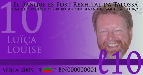
I agree that the font needs to be changed- remember that this was a rudimentary idea. I wanted to show the formating more than something ready for printing.
Im gonna try some stuff different tomorrow- bills all in one color family, new fonts, new "security features", etc.
What do you guys think of the general layout (which I'd perfer not to putz too much with)?
|
|
|
|
Post by Jack Fenton on Aug 7, 2009 3:23:16 GMT -6
Do you have changeable files for those notes? All my notes are saved from .xcf files that can be changed at any time easily, and then have the chnge duplicated onto the rest in the series accurately.
'Tis good though.
|
|
|
|
Post by Deleted on Aug 7, 2009 7:12:54 GMT -6
What about the colors of the portrait? A full color photo is pretty uncommon and currency (and not an effective use of ink). What about some sort of grayscale or tri-color type of rendering that matches the color scheme?
|
|
|
|
Post by Jack Fenton on Aug 7, 2009 7:29:15 GMT -6
I'll make a tri-colour version on Vector Magic, and then we can colourify as appropriate in GIMP?
|
|
EM Vürinalt
Citizen since 12-20-2007
Parletz, am?c, en entrez
Posts: 979
|
Post by EM Vürinalt on Aug 7, 2009 8:11:29 GMT -6
That sounds good. As long as the colors can be easily changed on Adobe so it looks nice.
I'm only designing the front of the bills right now. I'm almost done with another example (this time a 5 louise note) using the same format as my previous one, but incorporating suggestions people have made thus far.
I won't put the portrait on it until we have a single colour version, but I will designate the area where it would go.
|
|
EM Vürinalt
Citizen since 12-20-2007
Parletz, am?c, en entrez
Posts: 979
|
Post by EM Vürinalt on Aug 7, 2009 9:19:03 GMT -6
Here's number two. I perfer this over my last attempt because it looks a tad more "real." I did put the portrait on it because it'd look awkward without it. "Security features" include microtext in the green band that says "Regipäts Talossan Kingdom of Talossa" on it. Then theres the ben glyph "watermark" and the subdued 5's in the upper right hand corner. 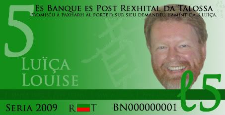 |
|
|
|
Post by Jack Fenton on Aug 7, 2009 10:36:29 GMT -6
Do you have a file of that note that still has the original layers in it? That way I'd be able to fiddle with it in GIMP.
And how about I stick to the backs of the notes since that's the bit I like. I've made the back for a 20L note with Sir Fritz on it, but I'm not happy with the guilloche in the corner, so I'll replace that.
|
|
EM Vürinalt
Citizen since 12-20-2007
Parletz, am?c, en entrez
Posts: 979
|
Post by EM Vürinalt on Aug 7, 2009 11:34:14 GMT -6
Yeah I should be able to email you a file with all the layers in it- do you have photoshop? If not I just need to know what kind of file to save it as so you can use it.
I'll work on the rest this afternoon- they're all pretty straightforward changes but I would like to change them up a tad too. Right now I'm thinking of changing the ben glyph to the lesser arms for the 20 and 50 and then use the greater arms for the 100 and 200.
Other than that the layout's going to be the same minus some added security features as you increase the denomination.
|
|
|
|
Post by Jack Fenton on Aug 7, 2009 11:36:53 GMT -6
GIMPs's native file is .xcf, but it can take .psd fine.
|
|
|
|
Post by Deleted on Aug 7, 2009 12:01:16 GMT -6
Here's number two. I perfer this over my last attempt because it looks a tad more "real." I did put the portrait on it because it'd look awkward without it. "Security features" include microtext in the green band that says "Regipäts Talossan Kingdom of Talossa" on it. Then theres the ben glyph "watermark" and the subdued 5's in the upper right hand corner. I really like this. Just out of curiosity, how would we go about printing such currency with security features like these? |
|
|
|
Post by Jack Fenton on Aug 7, 2009 12:36:19 GMT -6
Well a watermark is made when the paper is made, so that's out. As for micro-text, I say we just print high-def and hope for the best.
By the way, what colour will 200L be? If it's the highest I think it should be grey/black, but if it's not I suggest either red or teal.
The trouble with issuing large amounts is that they could be vulnerable to counterfeiting.
|
|
EM Vürinalt
Citizen since 12-20-2007
Parletz, am?c, en entrez
Posts: 979
|
Post by EM Vürinalt on Aug 7, 2009 12:41:00 GMT -6
|
|
|
|
Post by Iustì Carlüs Canun on Aug 7, 2009 12:53:49 GMT -6
"Bank" in Talossan is banqeu, not banque.
Just pointing it out, so we don't print bills with typos.
|
|
|
|
Post by Deleted on Aug 7, 2009 13:12:38 GMT -6
Perhaps we will hve these in time for a TalossaFest in a year or so?
|
|