|
|
Post by Þon Txoteu É. Davinescu on Oct 29, 2016 13:47:42 GMT -6
I have read the links, I'm just wondering if I missed something. The boxed off shield looks fantastic but researching the other CoA's of the realm, I didn't see any others of that style. As for the charges, I'm only seeking advice as there are so many options I'm finding it difficult to find a starting point to nail a few down. Sorry if I wasn't very clear, senior year of college is frying my 34 year old brain!
|
|
|
|
Post by Béneditsch Ardpresteir, O.SPM. on Oct 29, 2016 15:43:13 GMT -6
not sure of what you mean by a boxed off design.
the final shield that the kingdom would offer you is going to be in the design and layout of the shield of others found in the kingdom including mine.
its easier to make the designs of a different escutcheon on paint (as i don't have a PS software).
think 'bout your charge(s) and let me know. take your time, there's nothing to hurry.
am nearing 36 myself, so i guess i can relate to certain things.
if am not found available here, kindly drop me a mail at <benard@legalics.com>.
|
|
|
|
Post by Þon Txoteu É. Davinescu on Oct 29, 2016 22:17:39 GMT -6
OK... rotate cross bars to full axis (up/down-left/right), drop the Sable and make all four corners Azure. In the upper left (facing the CoA) to have an eagle in gold or white.
Make bars of cross wider/thicker, within the cross bar place a Gules Label.
In the bottom right corner, place a book in white
|
|
|
|
Post by Béneditsch Ardpresteir, O.SPM. on Oct 30, 2016 14:47:15 GMT -6
|
|
|
|
Post by Þon Txoteu É. Davinescu on Oct 30, 2016 15:09:09 GMT -6
Not even close. With the Label in red (for fist son) across the cross bar of white, the golden eagle (for my Kentucky Colonel commission) the upper left corner and the white open book in the lower right. The only reason I chose blue & white is they are the official colors of Southwestern Christian University, from which I will graduate in May.
We can add a white star to the lower left and upper right to further distinguish the design if you still feel there's too much similarity.
|
|
Sir C. M. Siervicül
Posts: 9,636
Talossan Since: 8-13-2005
Knight Since: 7-28-2007
Motto: Nonnisi Deo serviendum
|
Post by Sir C. M. Siervicül on Oct 31, 2016 15:28:59 GMT -6
With the Label in red (for fist son) There are a couple of issues with this. First, to my knowledge (though I would happy to be corrected on this) the label only appears in chief (in the top part of the escutcheon, or shield). Second, the label means not just that the bearer is a first son, but that the bearer's father is an armiger who bears the undifferenced arms (the arms without the label). I assume that that is not the case here, as you seem to be working on a new design rather than discussing adding a label to pre-existing arms). If your father does not already bear arms and you want a grant that is new to you, it should be a unique design and should not contain charges that misleadingly appear to be marks of cadency added to preexisting arms. Otherwise, the correct way to go about things would be for your father to become a Talossan and request a grant of arms, and you would bear the arms differenced with a label during his lifetime. Then when he passes (may the day be long in coming), you would inherit the undifferenced arms. |
|
|
|
Post by Þon Txoteu É. Davinescu on Oct 31, 2016 21:11:56 GMT -6
Whoops! That's one I didn't know! I completely concur with dropping the Label from the design as this is to be a grant of new Arms.
Thank you kind Sir!
Jeremy
|
|
|
|
Post by Béneditsch Ardpresteir, O.SPM. on Nov 3, 2016 5:28:54 GMT -6
|
|
|
|
Post by Béneditsch Ardpresteir, O.SPM. on Nov 3, 2016 5:37:21 GMT -6
Not even close. With the Label in red (for fist son) across the cross bar of white, the golden eagle (for my Kentucky Colonel commission) the upper left corner and the white open book in the lower right. The only reason I chose blue & white is they are the official colors of Southwestern Christian University, from which I will graduate in May. we can add a white star to the lower left and upper right to further distinguish the design if you still feel there's too much similarity. would you like a wavy cross (or other variations) like these - amtwiki.net/amtwiki/images/3/30/Variations.jpgthen it would be easier. otherwise am sorry but your cross is too similar to the flag i mentioned earlier. |
|
|
|
Post by Þon Txoteu É. Davinescu on Nov 3, 2016 20:47:51 GMT -6
Can we try the "wavy cross"?
|
|
|
|
Post by Þon Txoteu É. Davinescu on Nov 23, 2016 22:51:29 GMT -6
Been 3 weeks... is everything OK?
|
|
|
|
Post by Ián B. Anglatzarâ on Nov 24, 2016 0:31:39 GMT -6
Tag people or message them as well. That's usually more efficient.
|
|
|
|
Post by Béneditsch Ardpresteir, O.SPM. on Nov 28, 2016 8:44:36 GMT -6
its a bit difficult to design the same on word... would do the neccesary asap
|
|
|
|
Post by Béneditsch Ardpresteir, O.SPM. on Jan 14, 2017 5:38:54 GMT -6
 coa base |
|
|
|
Post by Béneditsch Ardpresteir, O.SPM. on Jan 14, 2017 5:55:46 GMT -6
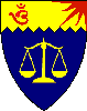
 Þon Txoteu É. Davinescu Þon Txoteu É. Davinescu , pl. find the draft design. i guess you wanted the eagle facing the other way - this can be done. plus you wanted the eagle in gold? rt? |
|